IYPT logo
The logo with two horses and armed knights has been an integral part of the competition’s visual identity since the early 1980s, when the Tournament was run as a local event in the USSR, years before attracting the first non-Soviet teams and turning into the IYPT. Readily recognizable, the logo is widely used today at both IYPT and many regional competitions.
Origins
No source ever reported the name of the artist, until Evgeny Yunosov recalled a name in a brief interview in March 2008. In July and August 2012, further details were recovered from Evgeny Yunosov and co-organizer Pavel Elyutin, and it occurred that this initial information was not correct.
The actual author is now confirmed to be Alexander Nikulin, a Russian research physicist. We did not yet reach the artist for comments or recollections about his work.
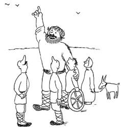
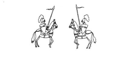
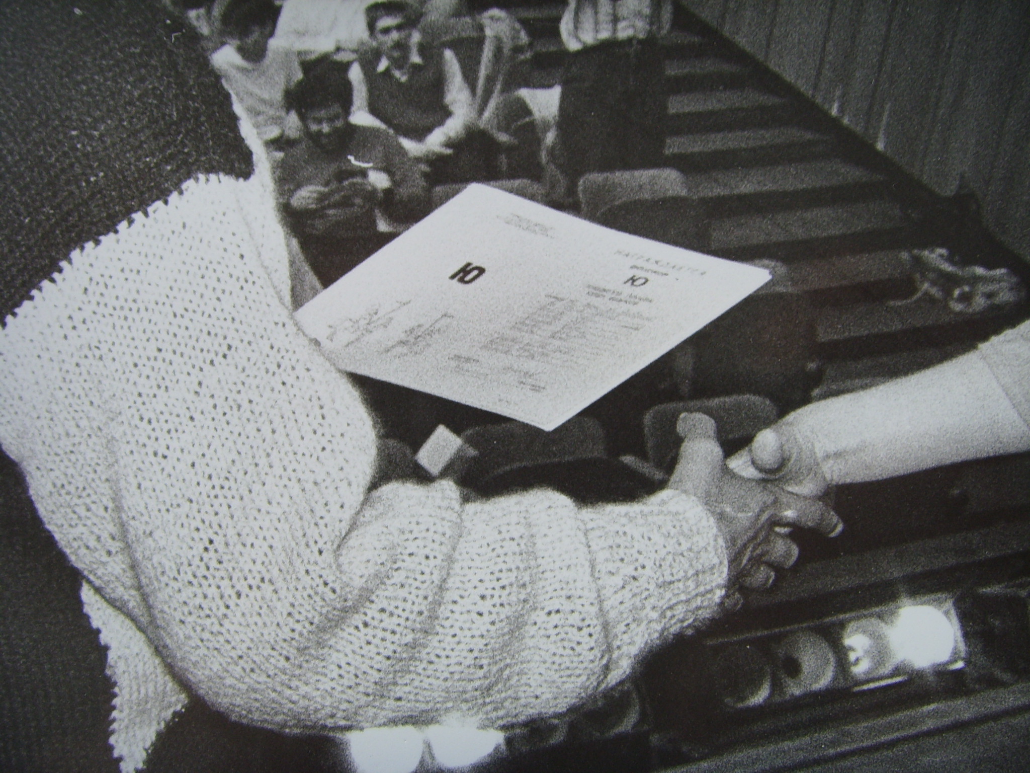
The first currently known public appearance of the logo was in a 1982 issue of Kvant, a Soviet journal in popular physics and mathematics. The logo was featured in a Evgeny Yunosov’s paper that reported the results of the 3rd Moscow YPT and was seemingly itself the second earliest YPT-related article. The paper was published in February 1982 but submitted to journal before December 16, 1981, when the edited issue was sent to manual typesetting. Note that the shields read E = mc2 and E = ℏω, with the reduced Planck’s constant ℏ = h/2π, and angular frequency.
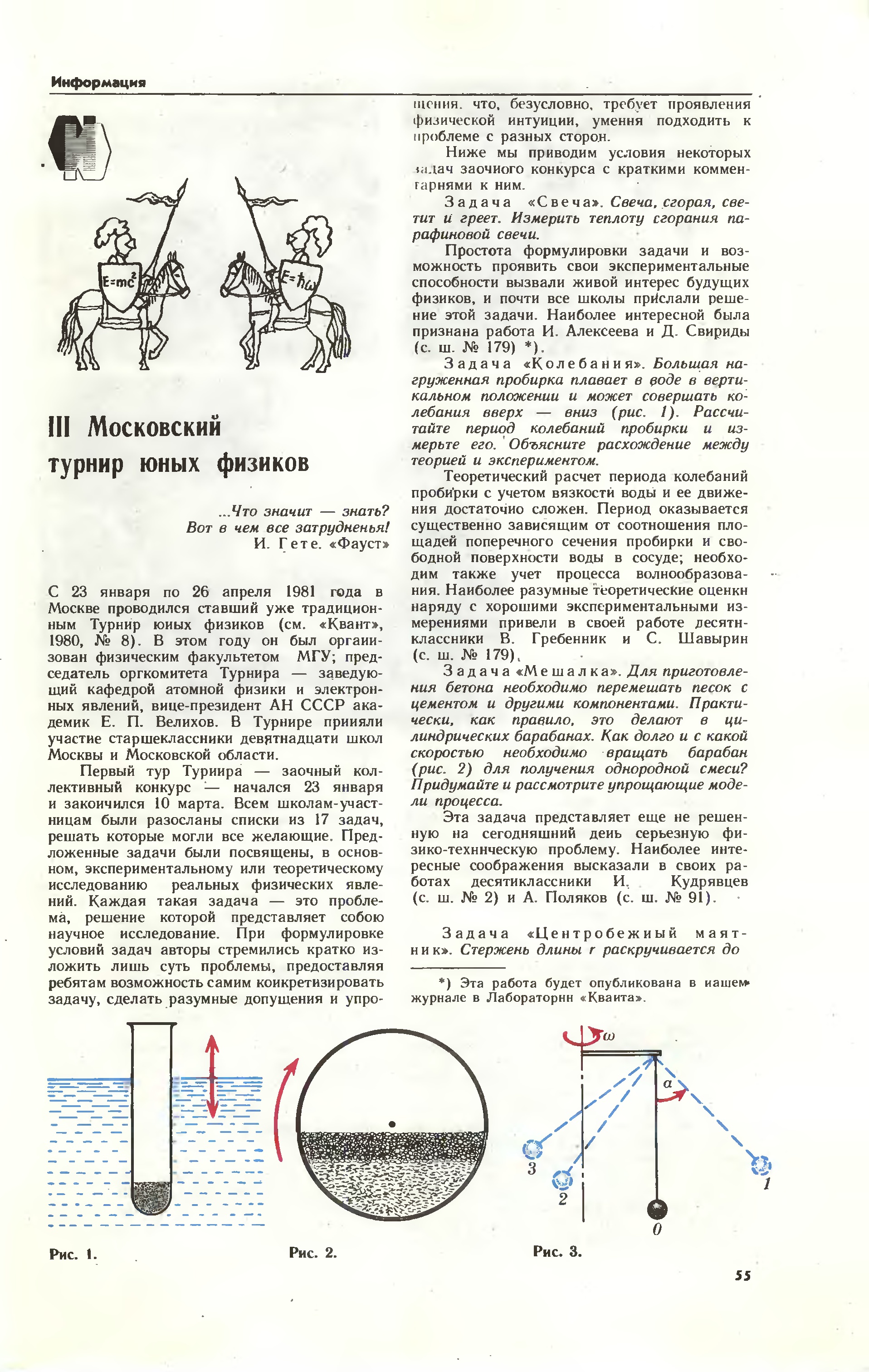
Source: Квант, №2, 1982, стр. 55. Click to see the origin in maximum available resolution
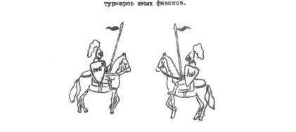
The same, or nearly identical, drawings were re-used in Kvant in September 1982, October 1983, September 1984, August 1985, and August 1986, while further Kvant publications, e.g. those focusing on the early IYPTs, included no logo at all.
A 77-page book Turnir junyh fizikov, published in 1987, featured the logo re-designed, with the drawing being closer to the today’s version and the second shield reading E = hν. An identical logo was used on the diplomas awarded to participants of the 1st IYPT.
Source: ТЮФ. — М.: МГУ, 1987, обл. Click to see the origin in maximum available resolution
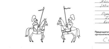
A booklet distributed to participants of the 1st IYPT brought a further update: both shields lost the left-hand sides of the equations and were reading simply mc2 and hν. Note that no known diplomas from the 2nd IYPT did feature the knight logo, using different visual elements instead.
Source: ТЮФ. — М.: МГУ, 1988, обл. Click to see the origin in maximum available resolution
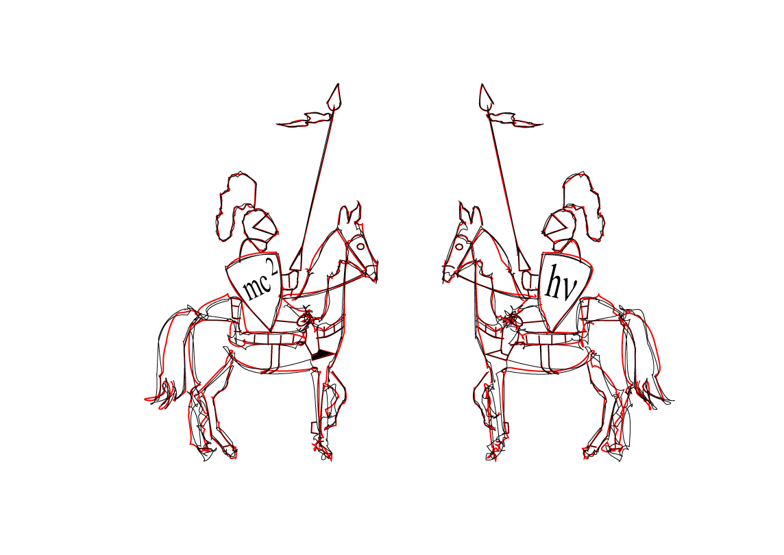
The diplomas and the logo dating back to 1990 were visually re-designed, and the same templates were later re-used in 1991 and 1992. The logo further re-appeared on the diplomas in 1993 (the last ones to be filled in manual handwriting.) This version of the drawing is identical in every nuance to the raster IYPT logo commonly known today.
Source: фотоархив Е. Н. Юносова, 1990. Click to see the origin in maximum available resolution
Source: Akos Csilling, 1990 (blog.ilyam.org, 2011.) Click for the maximum resolution

Source: Sergey Romanchuk, 1991 (blog.ilyam.org, 2010.) Click for the maximum resolution
Such printed logos were scanned one several occasions from 1994 onwards.
A Skotch floppy disk provided by Hans Jordens to Andrzej Nadolny around 1994 included the WordPerfect graphics files KNIGHT_1.WPG and KNIGHT_2.WPG, both last edited on January 10, 1994. These or similar scans were later circulating within the Organizing Committees, making one of the raster logos commonly used ever since.
Recent hi-res adaptations
At least on several occasions in the 2000s, the logo was re-drawn to get a higher resolution version.
Source: Paweł Wolak, Urszula Woźnikowska-Bezak, 2007. Click for maximum available resolution
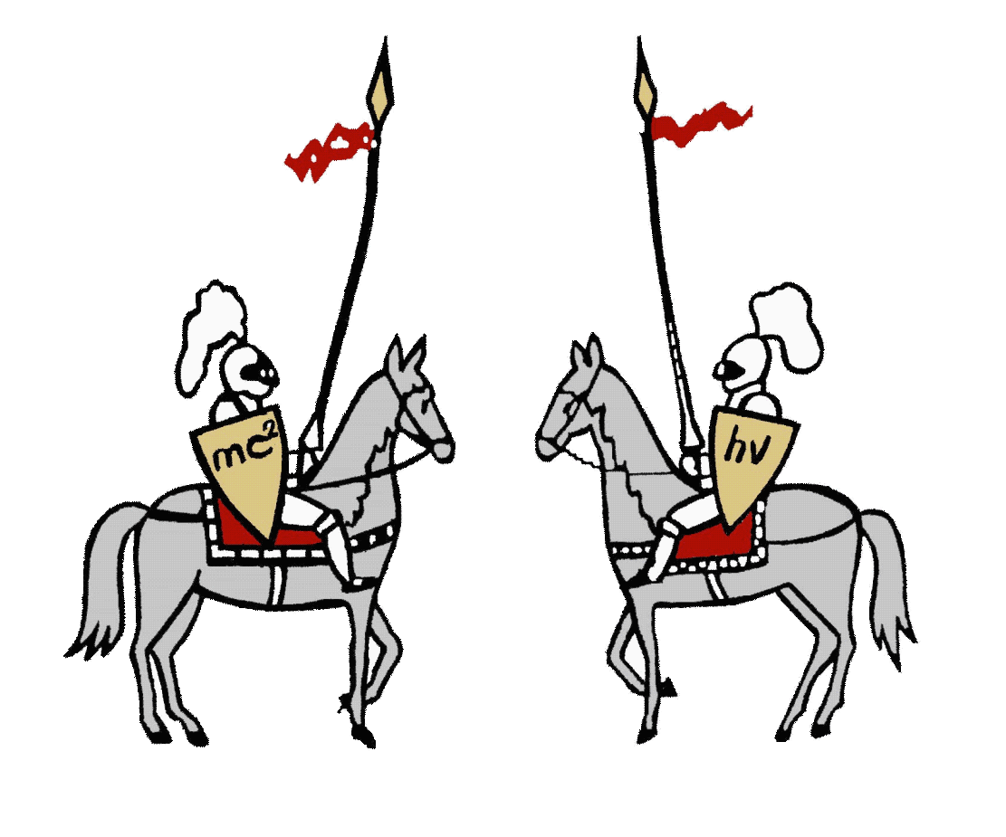
Source: ilyam.org. Click to see the maximum available resolution
If you have a vectorized or a high-resolution raster version, and feel interested to share it for the future use by community, or to include it into the Archive, just let us know.